Feb 24, 2005
Finally Moving Ahead for My Blog's Third Year
Welcome to my new design. Hopefully I didn't build your expectations too high after the delay. It is nothing fancy, but I do think it is a nice, clean design. I don't have access to Internet Explorer at the moment though, so if anyone would be willing to give it a spin on a Windows/IE system, I'd be appreciative of the feedback.
In honor of this new site design, and my blog's birthday (which I missed — it was the 21st), I have a short “history” of the iterations of this site posted below.
2001: Original Site
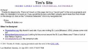 There wasn't a blog here yet, nor much of anything else. I built the site because I thought it was time I had a personal website. For years, I had been building sites for my company and for others, but never one for myself. Thus one Saturday evening, Tim's Site was born. Minimalism was the object — it was going to be a site where I posted stuff, not were I spent lots of time tinkering with the design.
 |
2001-2002: The Blue and Penguin Theme
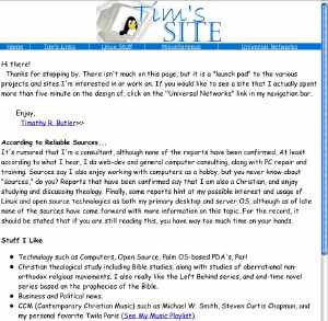 The site took a turn for the worst in the summer, in my estimation, here when I introduced this interesting combination of my “famous” little rendition of Tux, an ugly blue color and Comic Sans MS for the text. This was a dark day in my web design history. My blog premiered on the site one month before the demise of this design.
 |
2002-2003: Green the First
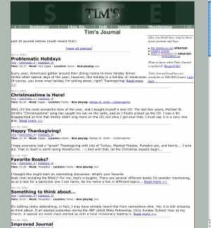 Green being my favorite color, it was inevitable that it would show up on my site eventually.
This design was one I worked on over Easter weekend, maintaining the navigation bar of the blue theme, but soothing colors, a more professional feel and no more Comic Sans MS. This design is the foundation of all future iterations of the site until the present one I am introducing today. |
2003: asisaid premiers
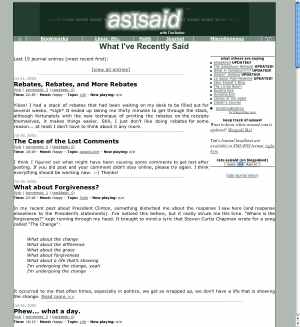 Sitting one day with a notepad in front of me, I started writing down names I could use for my site. Now that it had become mostly a blog, it seems to deserve a decent name. I picked asisaid while thinking of e-mail debates in which I would often reference back to what I had said by saying “as I said,” since people often don't seem to listen in debate (yes, I love to debate). I could also imagine some nice looking logos for it. The first asisaid design was the same as the 2002-2003 green design, save for the header. I do not have the original asisaid header handy, but the one in the picture was incorporated into the design within about two months.
 |
2003-2004: Blue Returns, or the Christmas Theme that Stuck
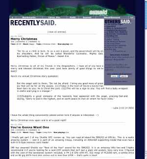 This was the last design to grace the late, great Ciaran's Journal blogging tool. It started out with the Christmas theme with a nativity and then gained the green hill when I got attached to the design and wanted to keep it for the rest of the year. The design was the same as the 2002-2003 green design and 2003 asisaid green design, save for the colors, the hill on top, and the purple/blue background behind the blogroll (instead of the previous white background).
 |
2004-2005: SAFARI Blues
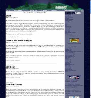 After the old blog tool died, I started restoring the site, and came close to making it look the same as the 2003-2004 design. However, I never completely replicated it, leaving out a few things such as the “Recently Said” graphic in favor of a quote du jour (I had started using quotes at the top in October 2004, but had kept the “Recently Said” graphic until I imported the theme into SAFARI.
 |
2005: Green the Second
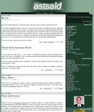 This is the present theme. It is the first theme to ditch almost all tables in favor of a CSS layout. The blog entries may violate W3C standards, but the template is verified as XHTML Transitional and CSS 2.0. Not exactly as dramatic as the War of the Roses, but the battle between green and blue continues as green sweeps back into control of the site.
You'll notice it uses similar colors and a similar logo backdrop to the 2003 asisaid design. It's logo background also recalls the November 2002 logo banners of the Sakamuyo log, which I had designed for Kevin. On the other hand, I have aimed to make this theme cleaner, more legible and more user friendly than past designs. I nuked the 2001-style navigation bar that linked to a bunch of outdated pages in favor of a new one, placed a special box just for quotes on the right side, and made a few other tweaks. You'll also notice that I kept the hill scene, but moved it to the bottom of the page.
What do you think? Let me know in the comments. |
 There wasn't a blog here yet, nor much of anything else. I built the site because I thought it was time I had a personal website. For years, I had been building sites for my company and for others, but never one for myself. Thus one Saturday evening, Tim's Site was born. Minimalism was the object — it was going to be a site where I posted stuff, not were I spent lots of time tinkering with the design.
 The site took a turn for the worst in the summer, in my estimation, here when I introduced this interesting combination of my “famous” little rendition of Tux, an ugly blue color and Comic Sans MS for the text. This was a dark day in my web design history. My blog premiered on the site one month before the demise of this design.
 Green being my favorite color, it was inevitable that it would show up on my site eventually.
 Sitting one day with a notepad in front of me, I started writing down names I could use for my site. Now that it had become mostly a blog, it seems to deserve a decent name. I picked asisaid while thinking of e-mail debates in which I would often reference back to what I had said by saying “as I said,” since people often don't seem to listen in debate (yes, I love to debate). I could also imagine some nice looking logos for it. The first asisaid design was the same as the 2002-2003 green design, save for the header. I do not have the original asisaid header handy, but the one in the picture was incorporated into the design within about two months.
 This was the last design to grace the late, great Ciaran's Journal blogging tool. It started out with the Christmas theme with a nativity and then gained the green hill when I got attached to the design and wanted to keep it for the rest of the year. The design was the same as the 2002-2003 green design and 2003 asisaid green design, save for the colors, the hill on top, and the purple/blue background behind the blogroll (instead of the previous white background).
  After the old blog tool died, I started restoring the site, and came close to making it look the same as the 2003-2004 design. However, I never completely replicated it, leaving out a few things such as the “Recently Said” graphic in favor of a quote du jour (I had started using quotes at the top in October 2004, but had kept the “Recently Said” graphic until I imported the theme into SAFARI.
 This is the present theme. It is the first theme to ditch almost all tables in favor of a CSS layout. The blog entries may violate W3C standards, but the template is verified as XHTML Transitional and CSS 2.0. Not exactly as dramatic as the War of the Roses, but the battle between green and blue continues as green sweeps back into control of the site.


Join the Conversation
Re: Welcome to the New Design
Green!
Re: Welcome to the New Design
Looks great in Firefox and Opera Tim. IE, less so - the post section div is too wide and thus ends up at the bottom of the page under the right nav. Isn’t browser non-compliance fun?
I do like the brighter feel.
Re: Welcome to the New Design
And, if it’s time to talk about browsers, in safari, the sidebar info boxes are wider than the green column. Wether it’s because the content is too wide or the sidebar is too wide, I don’t know. I haven’t looked at your code. You might want to play with your widths, though.
Re: Welcome to the New Design
Very nice design - as long as it’s not in IE, that is… I see the same thing Warren did
Re: Welcome to the New Design
Ooooo! I love it! Green! You naughty boy!
Re: Welcome to the New Design
Well, in Opera for FreeBSD, all the boxes fit inside the proper margins, but I’m seeing a tiny font for your body text. My screen is 1280x1024 on a 19” monitor. In fact, the display is about half-screen width down the middle. Otherwise, it suits me fine.
Re: Welcome to the New Design
Nice job. To bad about the IE issue. (lol) Maybe you can start a trend and say that your site is optimized for Firefox.
Re: Welcome to the New Design
Width for secondwrapper is set to 700, but content width is 510 and weeklyquote/sidebar/miscbar are all set to 200. 510 + 200 = 710. Add in your various paddings and your 20-30px too wide. You might try dropping the content width to 480 and removing the widths from the weeklyquote and other bars within the sidebar, allowing them to size to the sidebar.
Re: Welcome to the New Design
Hi everyone, thanks for your comments. I need to get my PC working again so I can figure out how to make IE happy. Flip or Warren — Is it only acting up on article pages or on the front page too?
Kevin, the boxes are going over the edge by design. Hopefully that adds a little visual interest. I’m using Safari too (yes, I’m using Safari to view SAFARI). You’ll notice that wrapper is wider than secondwrapper for the purpose of insuring that despite the oversized column that the page is centered.
Warren: I’m glad you think the brighter look is an improvement too. Yes, browser non-compliance is very fun.
Mark: A Firefox button on the page might not be a bad idea… or I guess I could have it revert to the old design for IE users (I should check to see how many IE users I even have).
Re: Welcome to the New Design
Ed, do you have Times New Roman or Times installed? The CSS requests that the browser show the content in Times or another serif font at “normal” size (12 pt. by default, in most browsers). Do you have Mozilla installed? Any chance you could check it there? Thanks!
Re: Welcome to the New Design
So you’re telling me it isn’t a bug, it’s a feature?
Nothing wrong with doing it this way and I’m the last person to tell someone their personal blog has to fit any sort of design standards. Notice, though, that when I saw it, I automatically assumed it was “wrong,” You just have to be ready to get email from people. Don’t worry. I won’t send M Bean over to critique.
IE is known for adding border/padding widths incorrectly to objects. What that means is that it’s a real PITA to get your columns set right cross-browser.
Re: Welcome to the New Design
Front page, mainly, but I think you must have fixed that now. Looks much better now!
Re: Welcome to the New Design
It is always fun to have a fresh design for your blog. I wish I’d have thought to take screenshots for historical purposes. I go back to GreyMatter, one of the best Generation 1 blog tools out there. That is so blown out of the water by b2 and now, wordpress. It really is amazing how the last 3 years has moved blogging tools along.
Well, there was a tangent. I like the new design. I’ve never really been happy with my green theme attempts. This looks real good.
Forget IE. Real people use firefox (or another decent alt instead anyway). I don’t put any extra effort in my design to make IE work as I figure my IE visitors are few.
Oh, your comment preview page is still plain and white. Kinda anticlimatic.
Re: Welcome to the New Design
Flip: Great, glad to hear it! Thanks!
Josiah: Yup. To be honest, I’m not so organized as to have those snapshots, but thankfully, Wayback Machine had old versions of my site (although it appears not to have done much in the way of visiting the site for about a year now). You might try variations of your URL and see if it is in the Internet Archive.
Thanks for the comments on the design. I agree mostly about forgetting IE, I just want to make sure IE users can at least read the page.
I need to think of something to do to make comments more interesting looking…
Re: Welcome to the New Design
Woops! I should have rechecked this sooner.
Okay, I have the usual core fonts for X, plus Times New Roman. Using Opera with Qt libs, font.conf comes into play, and it’s really infuriating but I can’t parse the structure to tweak it. Of course I have Mozilla, but it’s sssoooo sssllooowww tttoooo oooppeeenn. The fonts are still too small and ugly, to boot. I’d be happier if you gave the generic ‘serif’ option first. Then I’d see it in Georgia.
Re: Welcome to the New Design
Hmm… not a bad idea, Ed. I’d see it in Adobe’s Times, which is what it is doing right now anyway for me.
Re: Welcome to the New Design
Minor thing. The #comments link doesn’t take me to the comments. I’m left at the top of the page.
Re: Welcome to the New Design
Ah, thanks, Kevin. That is now fixed.
Re: Welcome to the New Design
Well, it looks different now. Whatever you did is an improvement for fonts display.
Re: Welcome to the New Design
w00! Comments link fixed. Thanks, Tim!